In short :
- A good board holds four things: feeling words, a real color and texture palette, captioned photos tied to specific rooms, and a short action list.
- Start with three to five words for how each room should feel, then only keep images that match at least two of them.
- Pin actual samples like paint chips and fabric, and borrow single elements from photos instead of copying whole rooms.
- Keep it to roughly five to ten images per room, and check your own light and take a “before” photo first.
- Add a rough floor sketch, a three-item priority list, and a timeline so the board actually turns into a plan.
A home decor vision board should combine four layers: the feeling you want each room to give you, a simple color and material palette, real photos of rooms that match that direction, and a short list of concrete changes you can actually make. Words, fabric swatches, and a rough floor sketch turn vague taste into a workable plan.
Most boards fail for one boring reason: they collect pretty pictures that have nothing to do with the rooms you actually live in. A board built for a sunlit loft with twelve-foot ceilings will not help you fix a dark rental hallway. The fix is to build your board around your real space, your real habits, and a small number of decisions you can act on. Here is how to do it, layer by layer.
What belongs on a decor vision board beyond pretty pictures?
A useful board holds four kinds of material: atmosphere words, a color and texture palette, reference images tied to specific rooms, and a short action list. Pictures alone show taste; the other three turn taste into decisions.
Start with feeling words, not images
Before you tear out a single page, write down three to five words describing how each main room should feel. Calm, warm, uncluttered, playful, grounded, bright. These words act as a filter later: if an image does not match at least two of them, it does not go on the board. A living room tagged “calm” and “warm” will instantly rule out the glossy black-and-chrome photos you might otherwise pin on impulse.
Add a physical palette
Pin actual samples: a paint chip, a strip of fabric, a piece of wood veneer, a tile offcut. Physical swatches behave differently from screen colors, and seeing them side by side under your own lamp reveals clashes fast. A common case: a “warm white” paint chip that looks creamy in the store turns pinkish next to a grey sofa sample. Better to discover that on a corkboard than on a wall.
How do you choose images that actually match your home?
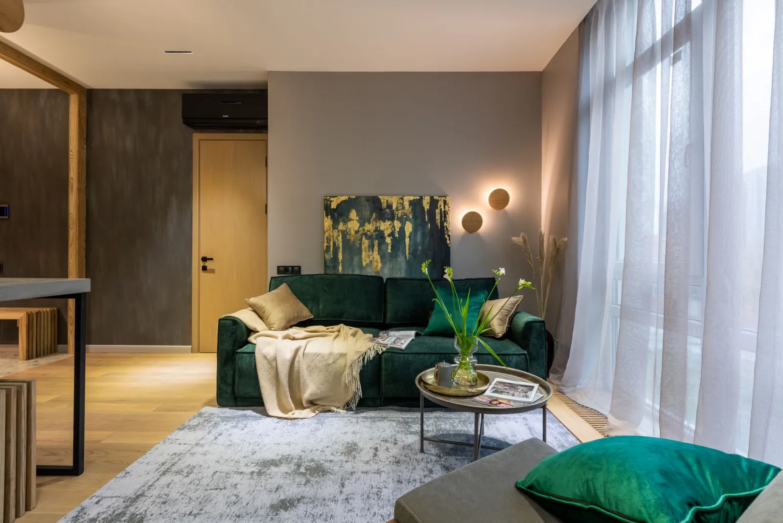
Choose images of rooms with a similar light level, ceiling height, and room size to yours, and label each one with the single element you want to borrow. A photo earns its place only if you can name what you are taking from it.
Borrow elements, not whole rooms
Whole-room photos invite copying; element-level notes invite adapting. Write a short caption under each image: “the low shelf under the window,” “the mix of two wood tones,” “the wall color behind the bed.” That single habit prevents the classic disappointment of recreating a photo and finding it feels wrong in your own space.
Check the light before you commit
North-facing rooms read cooler and dimmer; south-facing rooms flood with warm light for much of the day. A deep navy wall that looks rich in a bright, south-facing photo can look flat and heavy in a dim hallway. Sort your reference images by the light conditions they were shot in, and favor the ones that match your room. It is a small step that saves a repaint.
Include one “before” photo of your own room
Pin a photo of the actual space next to your inspiration. This keeps the board honest. Seeing your cluttered corner beside a serene reference makes the gap concrete, and the gap is where your action list comes from.
Which practical elements turn a board into a plan?
Add a floor sketch, a short priority list, and a timeline. These three items convert inspiration into something you can start on this weekend.
Sketch the room roughly
You do not need drafting skills. A rectangle with door and window positions, plus the main furniture footprints, is enough. Tape it to the board. When a furniture idea appears, you can check instantly whether it fits. A reading chair looks lovely in a photo until the sketch shows it would block the only walkway.
Write a three-item priority list
Pick the three changes with the biggest visual return for the least disruption. Typical candidates: lighting, wall color, and one anchor piece such as a rug or a sofa. A real example: someone bothered by a gloomy bedroom often gets more from a warmer bulb and a lighter wall than from a new bed frame. Ranking forces that trade-off into the open.
Set a rough timeline and budget band
Note which items are “this month,” “this season,” and “someday.” Grouping by horizon stops the board from becoming a wish list you never touch. It also helps you spot dependencies: painting usually comes before hanging shelves, not after.
| Board element | What it does | Example |
|---|---|---|
| Feeling words | Filters images and purchases | “Calm, warm, uncluttered” |
| Physical palette | Tests colors and textures together | Paint chip, fabric strip, wood sample |
| Captioned images | Names the element to borrow | “Low shelf under the window” |
| Floor sketch | Checks fit and flow | Door, window, and furniture footprints |
| Priority list | Directs effort and spending | Lighting, wall color, rug |
How should you organize and use the board over time?
Group the board by room, keep it visible, and review it every few months. A board that lives in a drawer is decoration for nobody; one on a wall or pinned above a desk keeps decisions in view.
One zone per room
Divide a large board into sections, or keep a small board per room. Mixing kitchen ideas with bedroom ideas creates visual noise and muddles the palette. Separate zones also let each room carry its own mood while sharing a few threads, such as a recurring wood tone or a repeated accent color.
Prune as you go
Remove anything you have ruled out. A board that keeps every idea becomes a source of guilt. When a paint sample gets rejected, take it down. The board should reflect current decisions, not the entire history of your thinking.
Review seasonally
Light changes through the year, and so do your habits. A review every few months catches drift: the reading corner you planned in winter may be too hot by summer. Small adjustments keep the plan aligned with how you actually live.
FAQ
Should a vision board be digital or physical?
Both work, and they serve different purposes. A digital board is easy to search and update, which suits collecting and comparing. A physical board lets you pin real fabric, paint chips, and tile samples, which is where color and texture decisions get made. A practical setup uses a digital folder for gathering and a physical board for the final shortlist.
How many images should go on a board?
Keep it tight enough to read at a glance, roughly five to ten images per room. Beyond that, patterns blur and the board stops guiding decisions. If you cannot say what you are borrowing from an image, it is filler.
What if my partner’s taste is completely different?
Build two columns on the same board and look for overlap. Shared feeling words are often easier to agree on than shared furniture. A couple who disagrees on style can usually agree on “warm and uncluttered,” and that common ground narrows the field fast.
Conclusion
Put four things on a home decor vision board: feeling words, a physical color and texture palette, captioned reference images tied to specific rooms, and a practical layer made of a floor sketch, a three-item priority list, and a rough timeline. Keep the board visible, group it by room, and prune it as decisions get made. That combination answers the question directly: the board is not a collage of dreams, it is a working tool. For the broader picture on planning a whole-home refresh, a more complete guide on the general theme is available on the site.
To choose the right model : Home Decor Clearance: How to Choose the Best Deals
Was this guide helpful?
Share your experience with the WiseHomeGuides community.